Panache
Panache Apple is a food technology company evolving beyond its roots in apple juice and cider production into advanced food-scanning technology. As the company expands into tech-driven solutions, its mission is to reduce food waste, improve food quality, and enhance supply chain efficiency.
Throughout this project, I worked as a student designer in collaboration alongside another student designer. We developed a comprehensive brand identity system to reflect Panache’s new direction. The challenge was to bridge the company’s agricultural heritage with its forward-thinking technological innovation. The resulting visual system positions Panache as a modern, technology driven brand while maintaining credibility within the food industry.
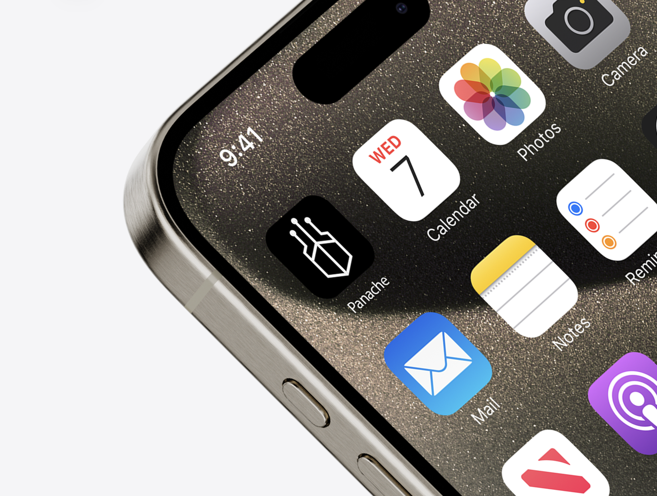
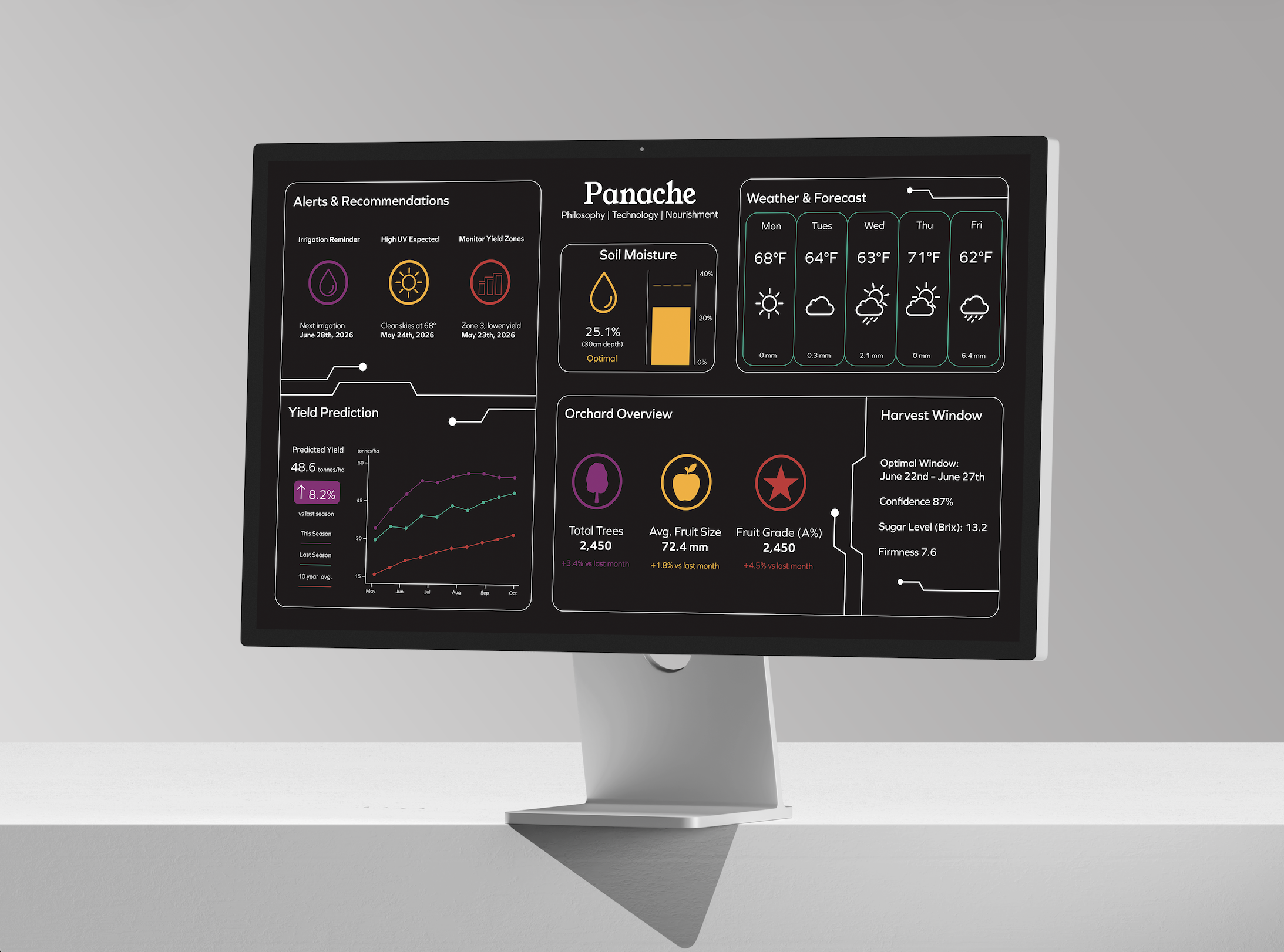
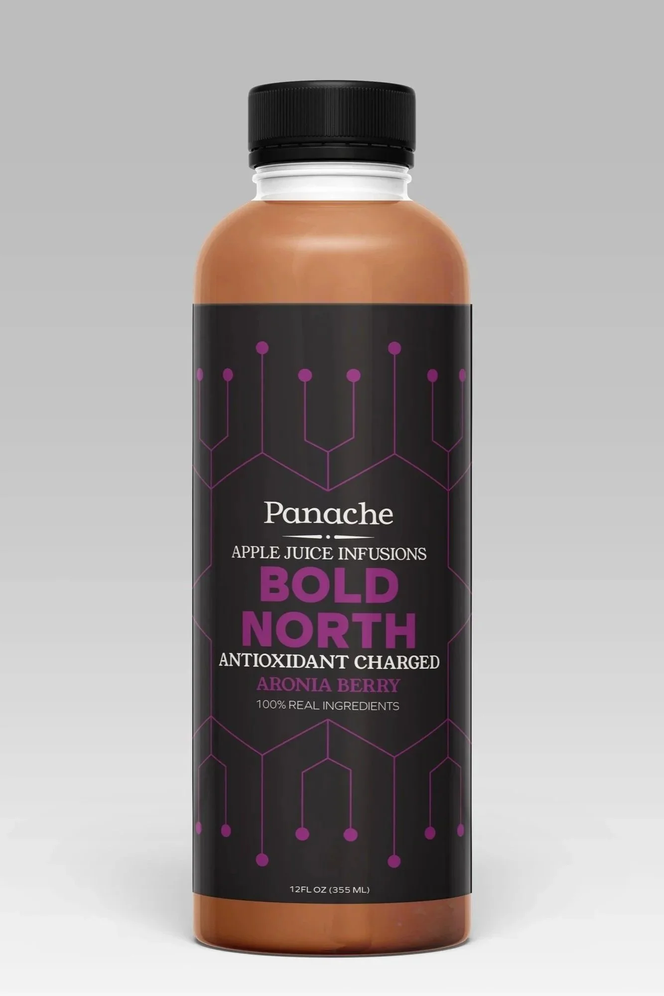
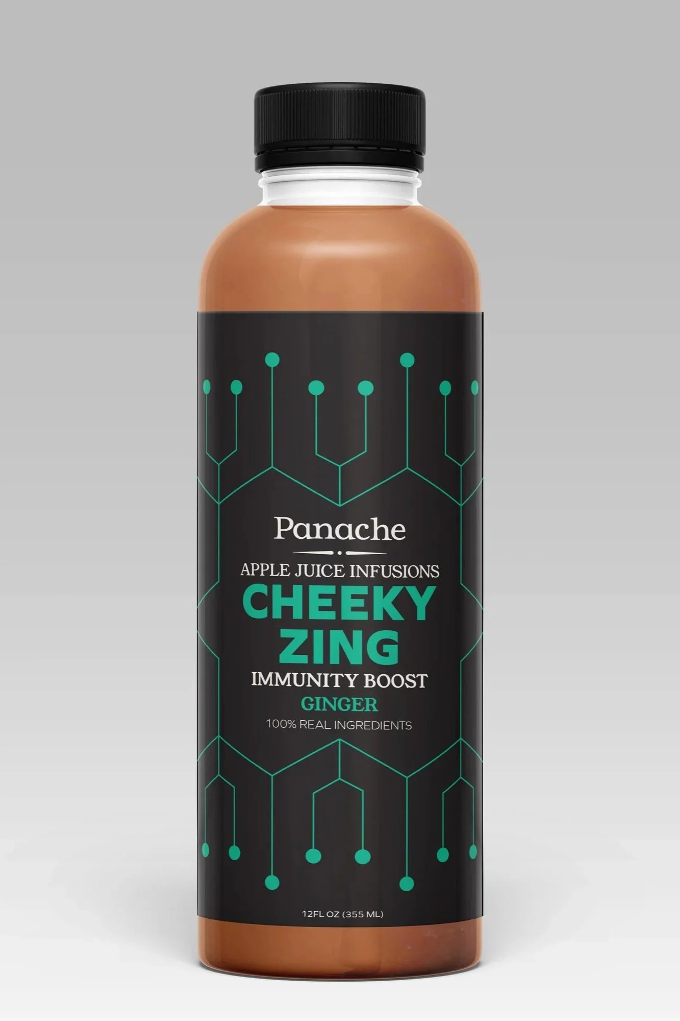
Panache is a company that’s rooted in Ayurvedic food science, French fermenting, and Minnesota apple harvesting. These values were in the forefront of my mind when working on the project. I created the data dashboard template, app icon, and juice bottles. Due to a non disclosure agreement, I cannot show more of the work that was done with the technology.
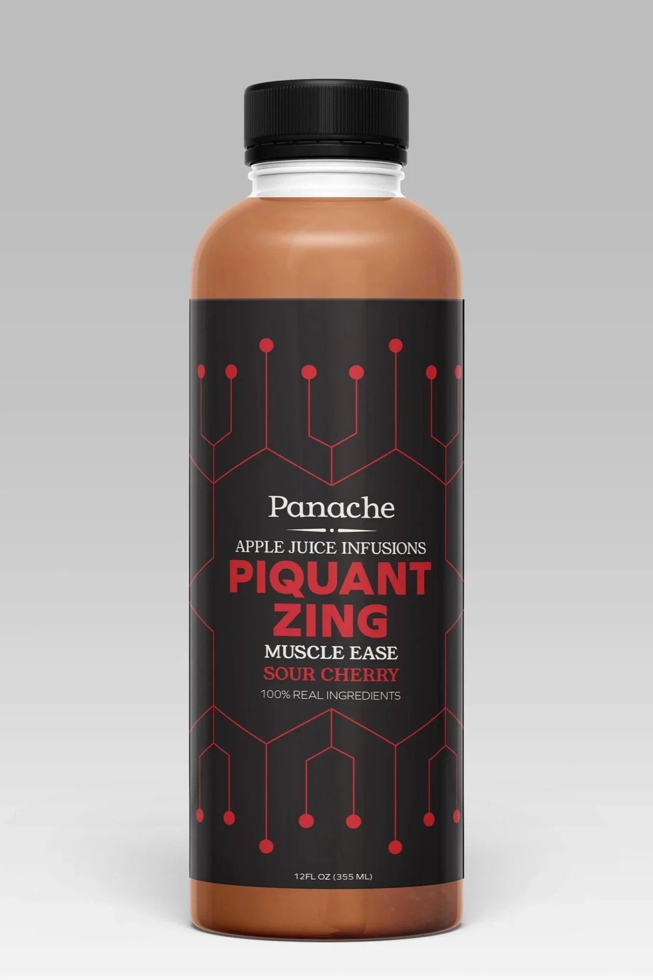
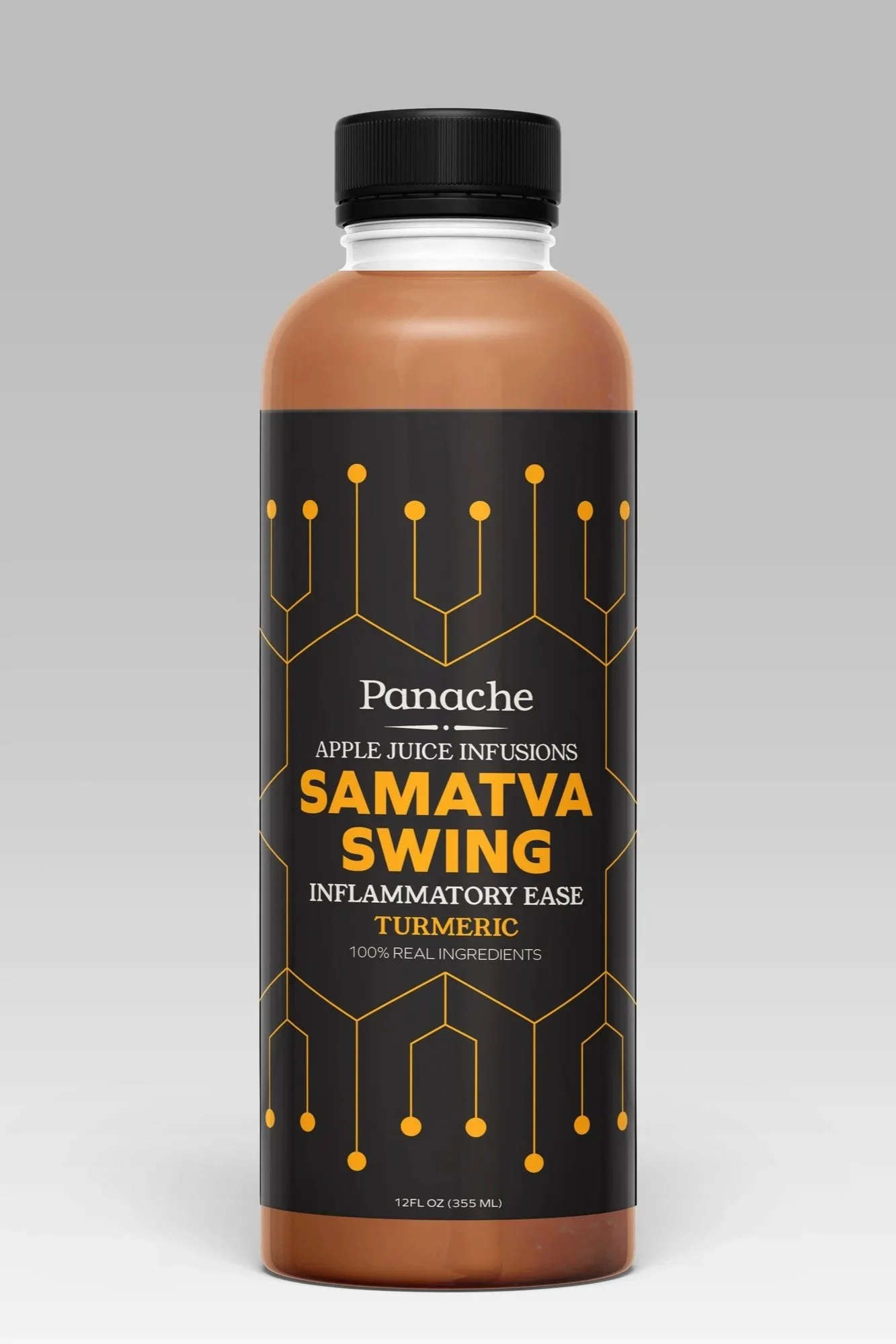
Technology Pattern
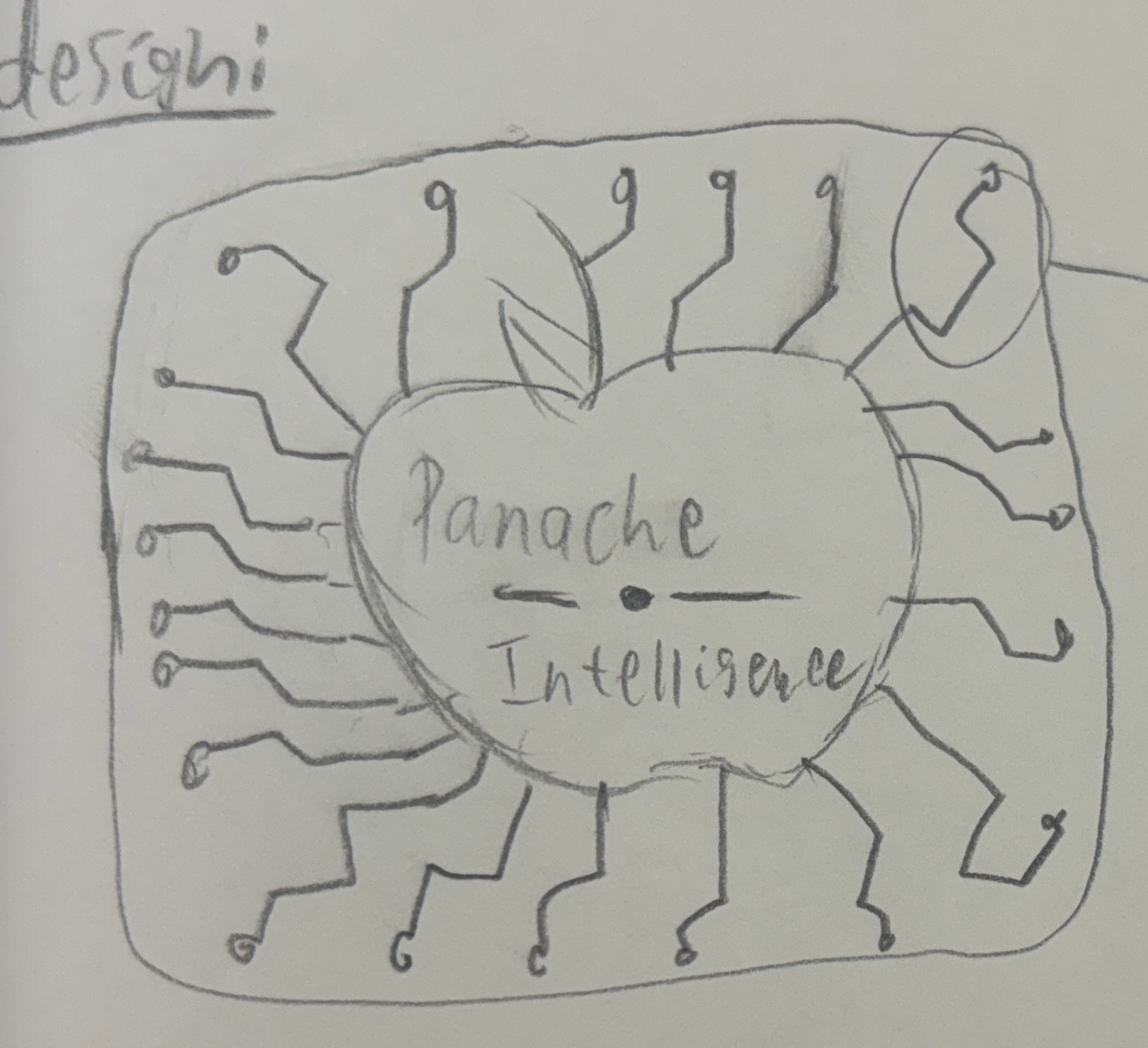
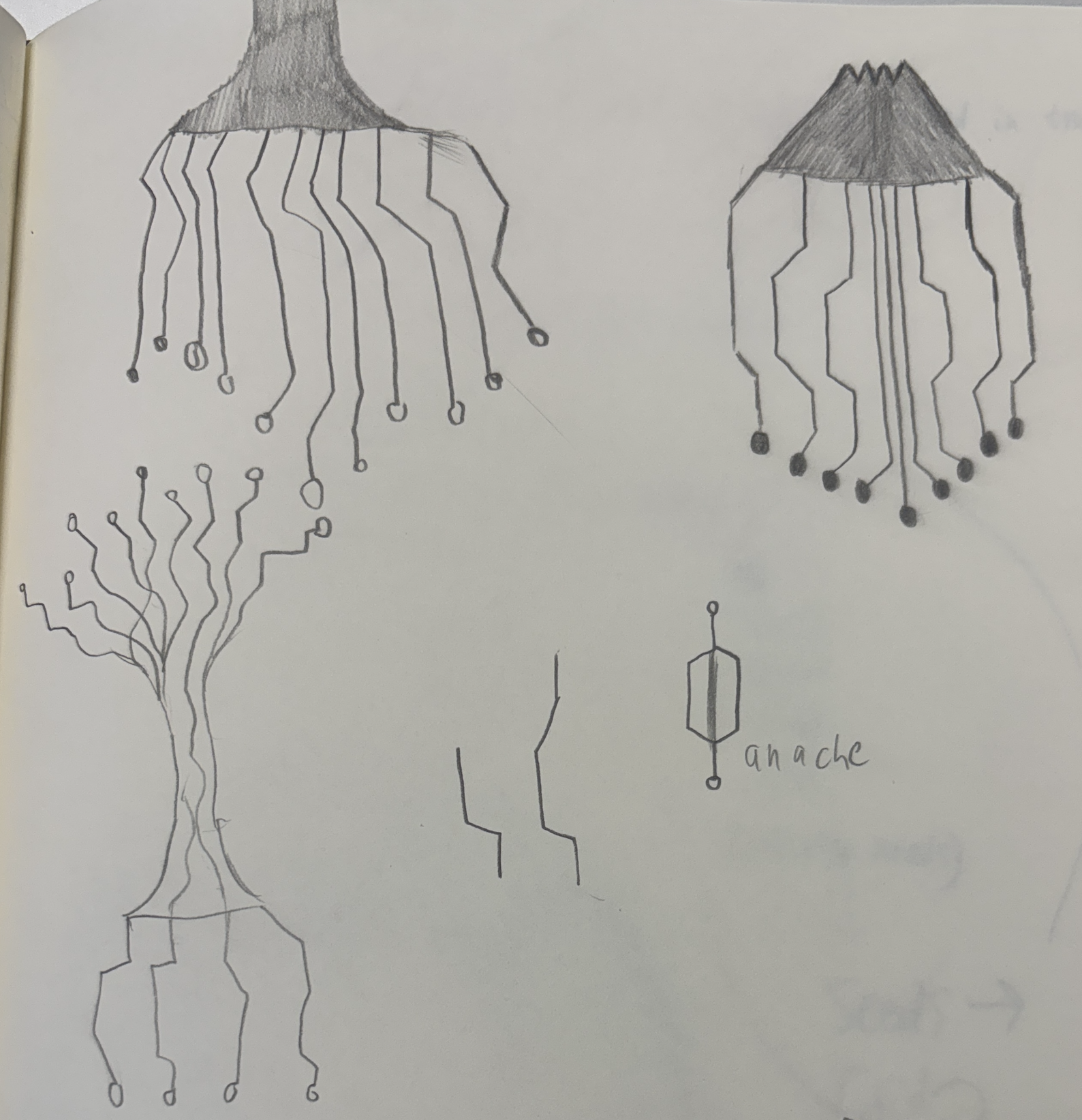
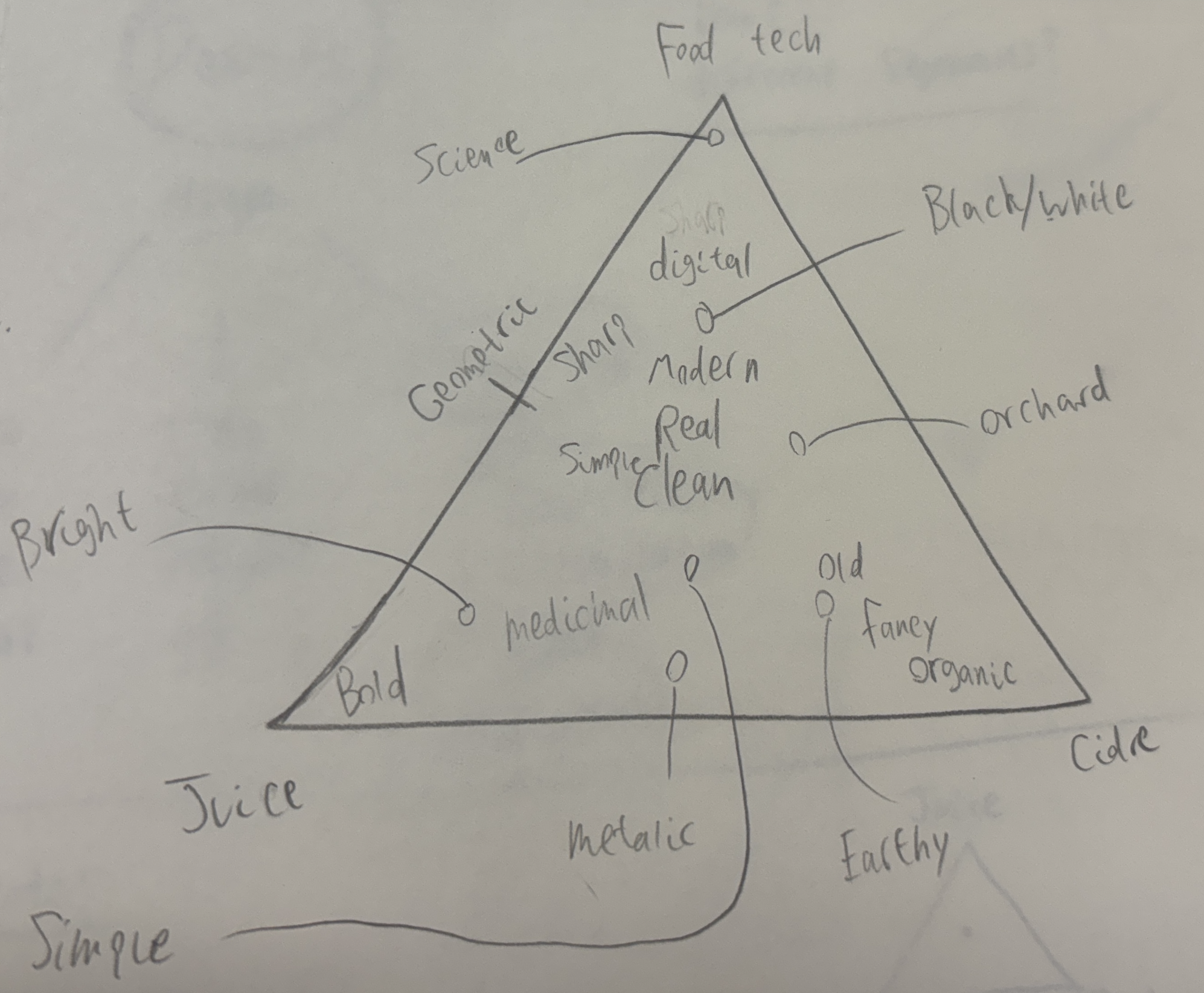
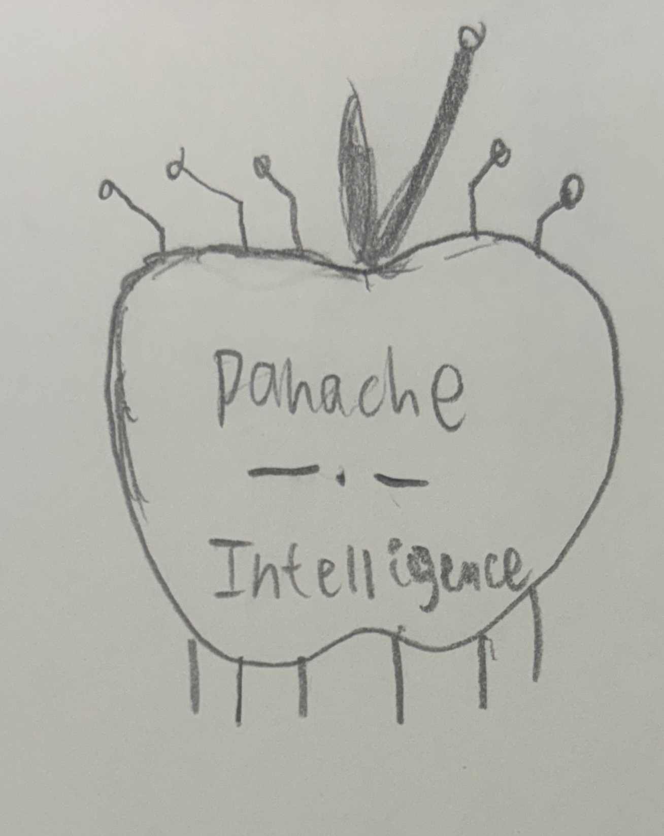
When creating the technology pattern, our goal was to represent technology and nourishment. Our process to create this pattern involved countless sketches, filled Illustrator files and writing exercises to conceive this idea. This pattern is used in contrast to bold typography to create engaging and clean visuals.

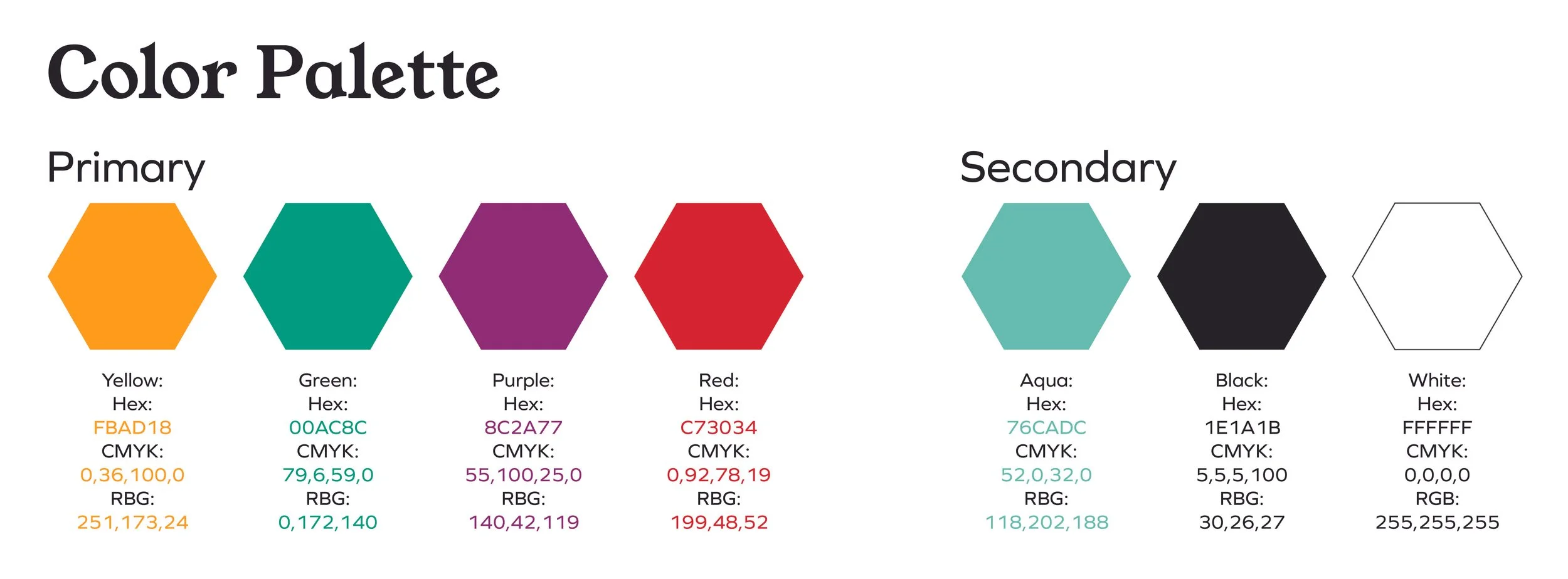
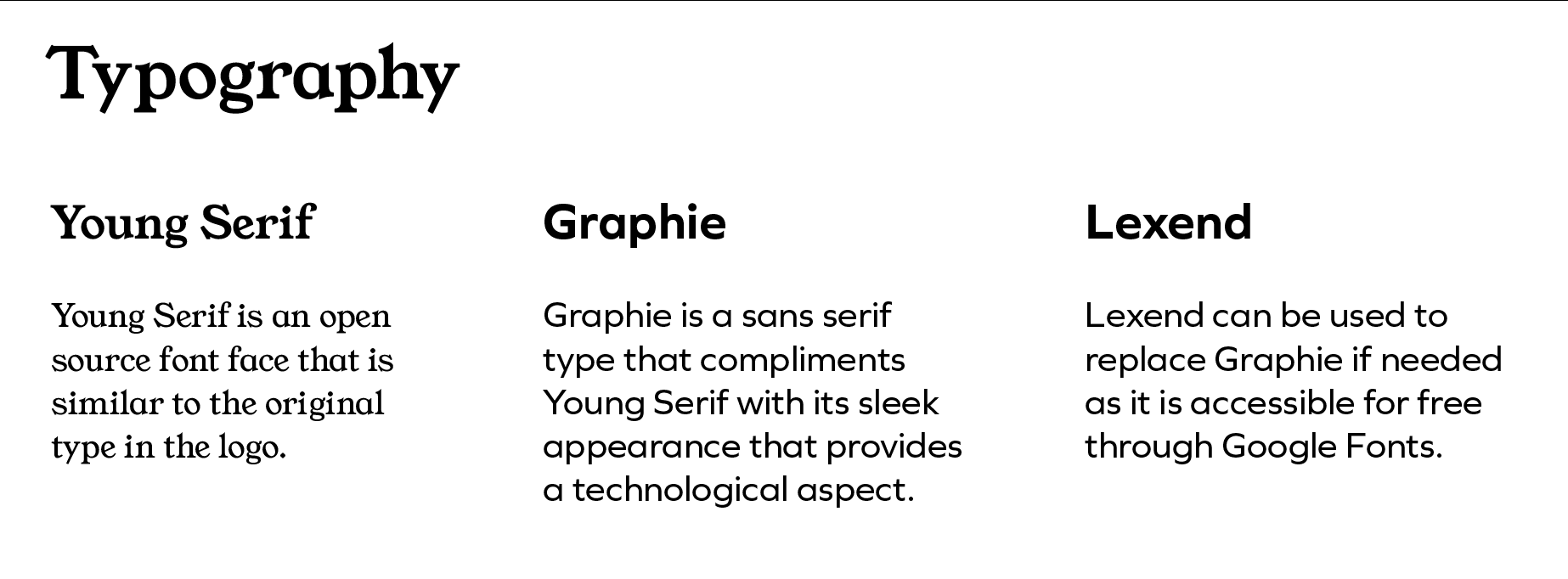
Brand Standards
Process